Cycles App Redesign
Redesigning the Cycles app to offer more than tracking, creating a space for guidance, support, and empowerment.
Overview
Context
Academic
Solo Project
Fall 2022
Role
UX Designer
UX Researcher
UI Designer
Timeline
4 weeks
Tools
Figma
Miro
Adobe Illustrator
Problem Space
Lack of Guidance to Understand Menstrual Cycles
Menstrual tracking apps often fail to provide the guidance and resources that users need to truly understand their cycles, leaving them feeling disconnected and unsupported.
Challenge
Redesigning for Clarity & Empowerment
The challenge was to bridge this gap by redesigning the app to not only track menstrual data but also provide tools that empower users with the clarity and confidence to better manage their health.
The Question No One Wants to Ask
It all began with a gap I couldn’t ignore. A couple months ago, I noticed something unsettling—Many users are not equipped with the information needed to manage their periods, leaving them feeling unsupported and unsure. Menstrual tracking apps often provide calendars and symptom tracking, but fall short in offering meaningful guidance or education to help users truly understand their cycles.
Diving Deeper
So, what kinds of educational resources?
To dig deeper, I conducted qualitative interviews with six individuals who use Cycles App or other menstrual apps, to learn what kinds of educational guidance users were seeking from their menstrual apps.
LISTENING AND LEARNING
What Do I Not Know?
01
Knowledge around Products & Symptoms
Users wanted clear, relatable explanations about common symptoms and menstrual products, helping them better understand their experiences.
02
Personalised & Credible Resources
There was a desire for tailored guidance that felt relevant to each user's unique health journey, creating a deeper sense of connection and support.
03
Easily Digestible Content
Educational content needed to be digestible—whether through visuals, text, or interactive features—ensuring that all users could easily access and understand the information.
Key Insight
Need to Focus on Educational Gaps
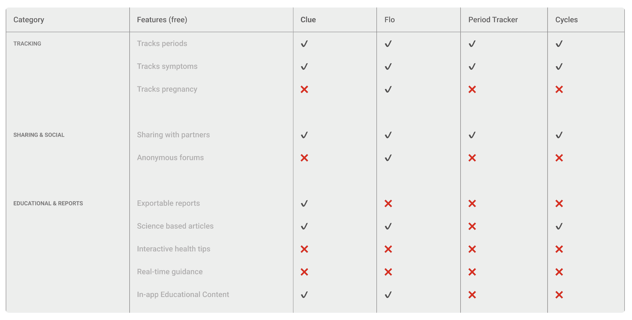
This revealed some common gaps, with a glaring one being the lack of educational guidance and actionable resources. Most apps tend to assume that users already have the knowledge, leaving little room for learning or discovery.


Key Insights
What do the Current Apps Lack?
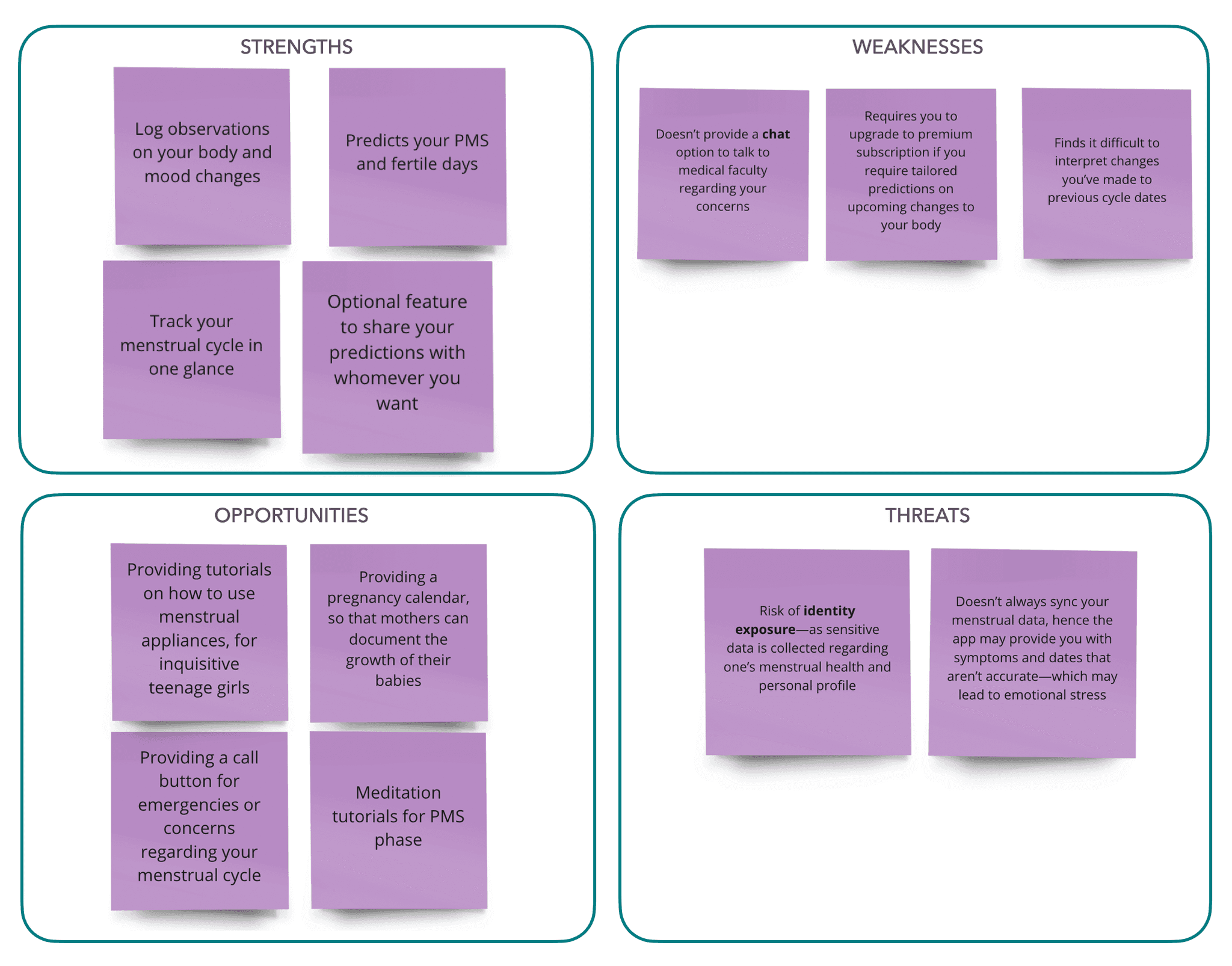
To understand what existing apps offered and identify their shortcomings, I conducted a competitive market analysis of commonly used menstrual tracking apps.
doodles source: streamlinehq.com
Understanding User’s Expectations
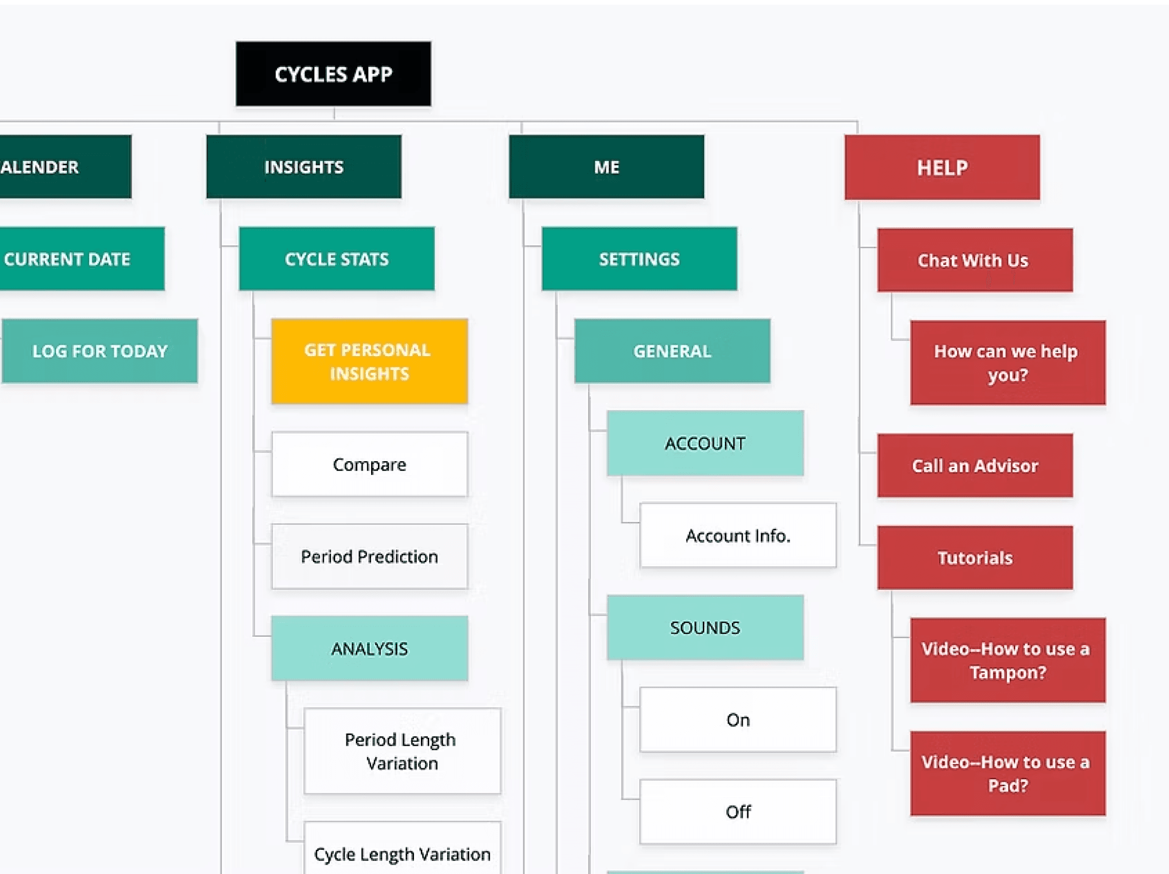
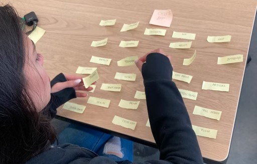
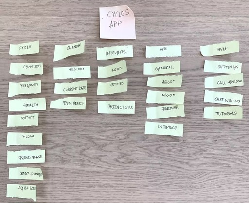
I conducted card-sorting exercises to redesign a flow structure that felt intuitive and aligned with user behaviours. I carefully integrated the key insights into the design to ensure the educational component was seamlessly woven into the tracking experience.
FROM RESEARCH TO IDEATION
Setting the Direction
Who am I Designing For: Establishing my Target Audience
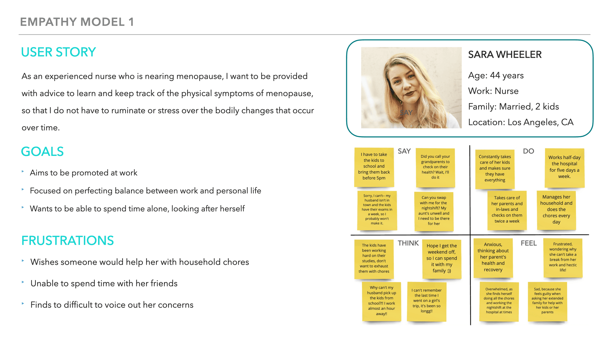
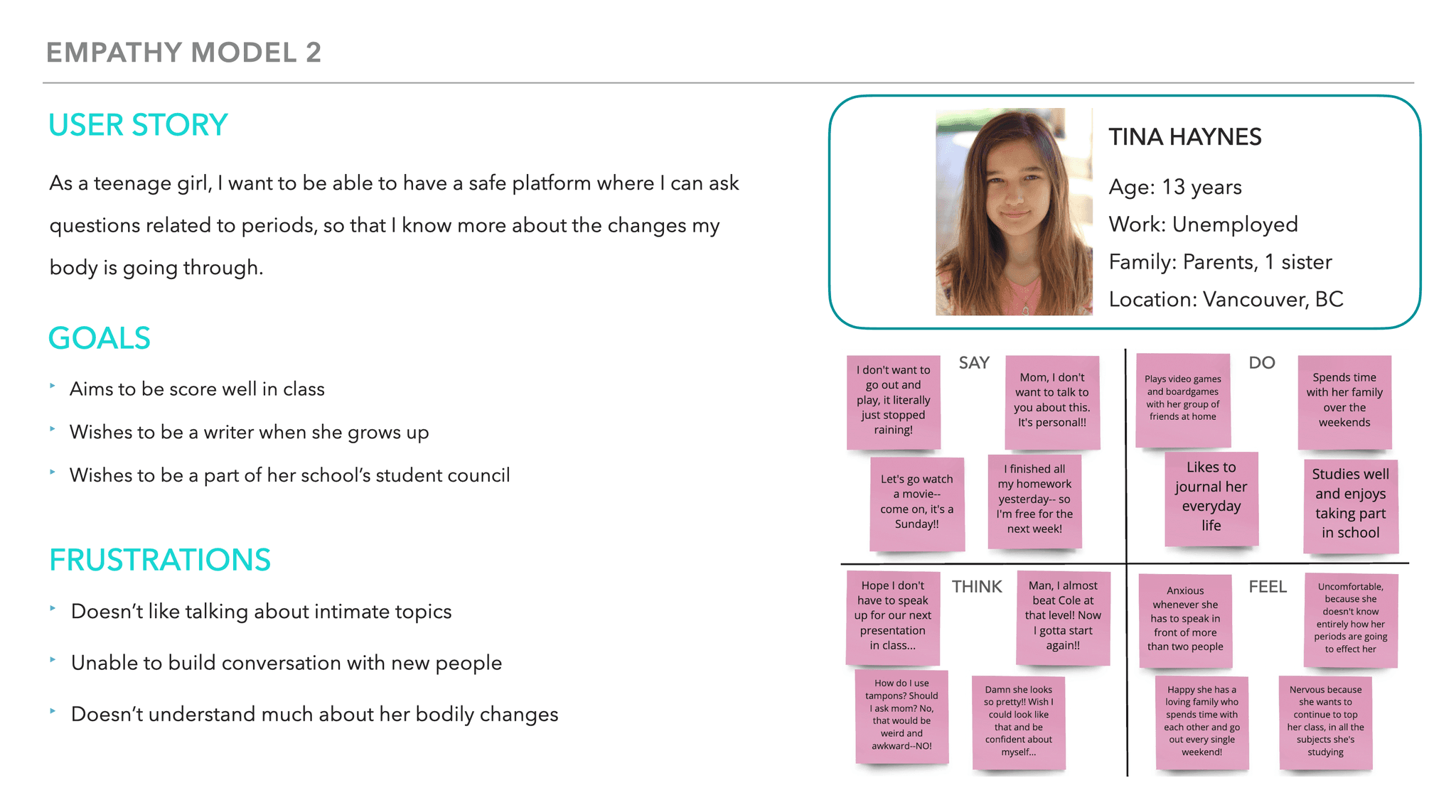
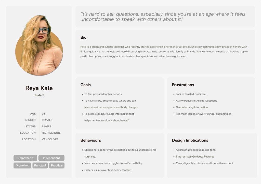
Based on the interviews I held, I decided to have my redesign focus on users newly introduced to menstruation—often young individuals experiencing their first cycles. This group typically feels hesitant to ask questions due to embarrassment or lack of safe spaces to learn.
Common Response
Participants preferred having the educational resources to be separated from existing tracking and prediction features.
Redesign Focus
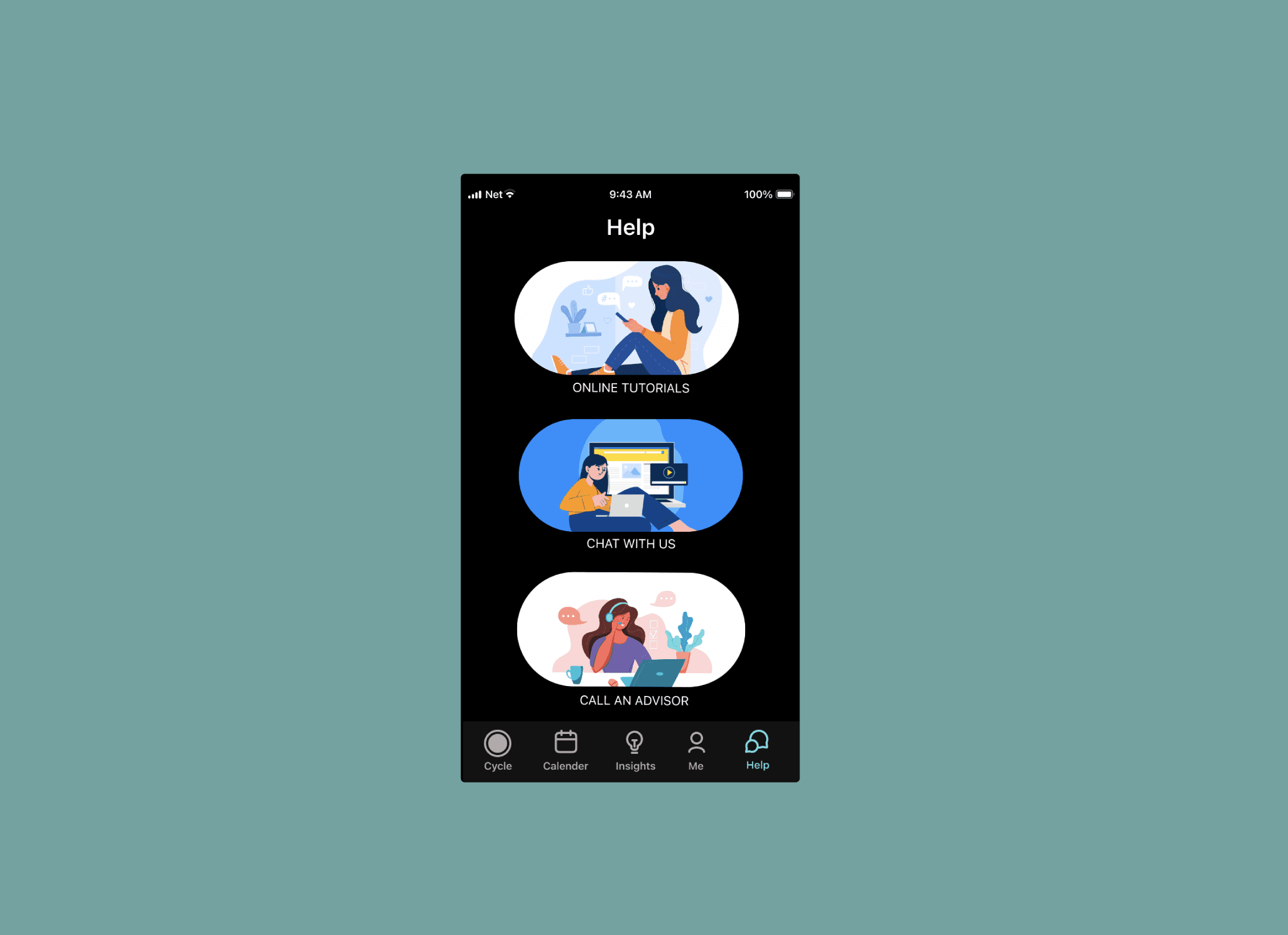
Introducing a Help Page
To make sure accessing the educational resources is easy and intuitive, I’ll be introducing another page to the app’s user flow.
Real Time Guidance
Providing tools to deliver immediate, relevant advice based on the user’s current cycle phase or symptoms.
Visual Content
Simplifying complex health information using visuals; to make it accessible for users at any knowledge level.
THE FINAL SOLUTION
Designing A Safe Space
Prototyping and User Testing the Redesign
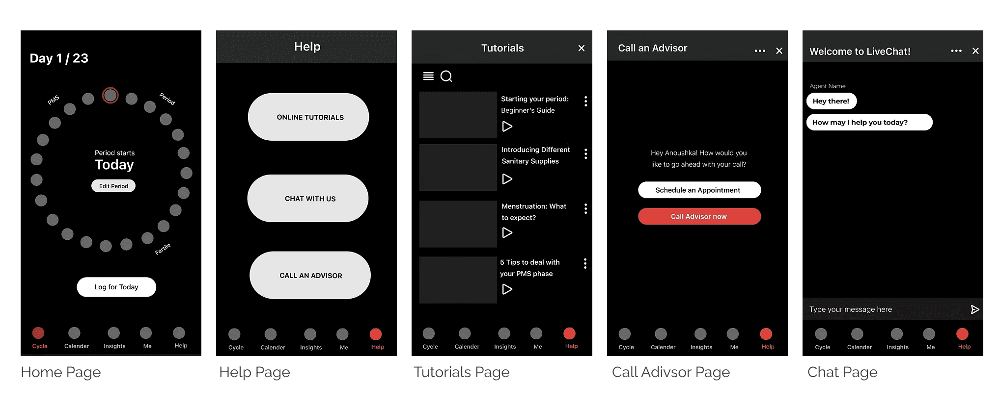
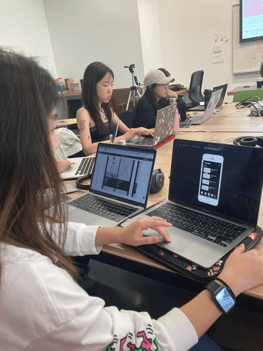
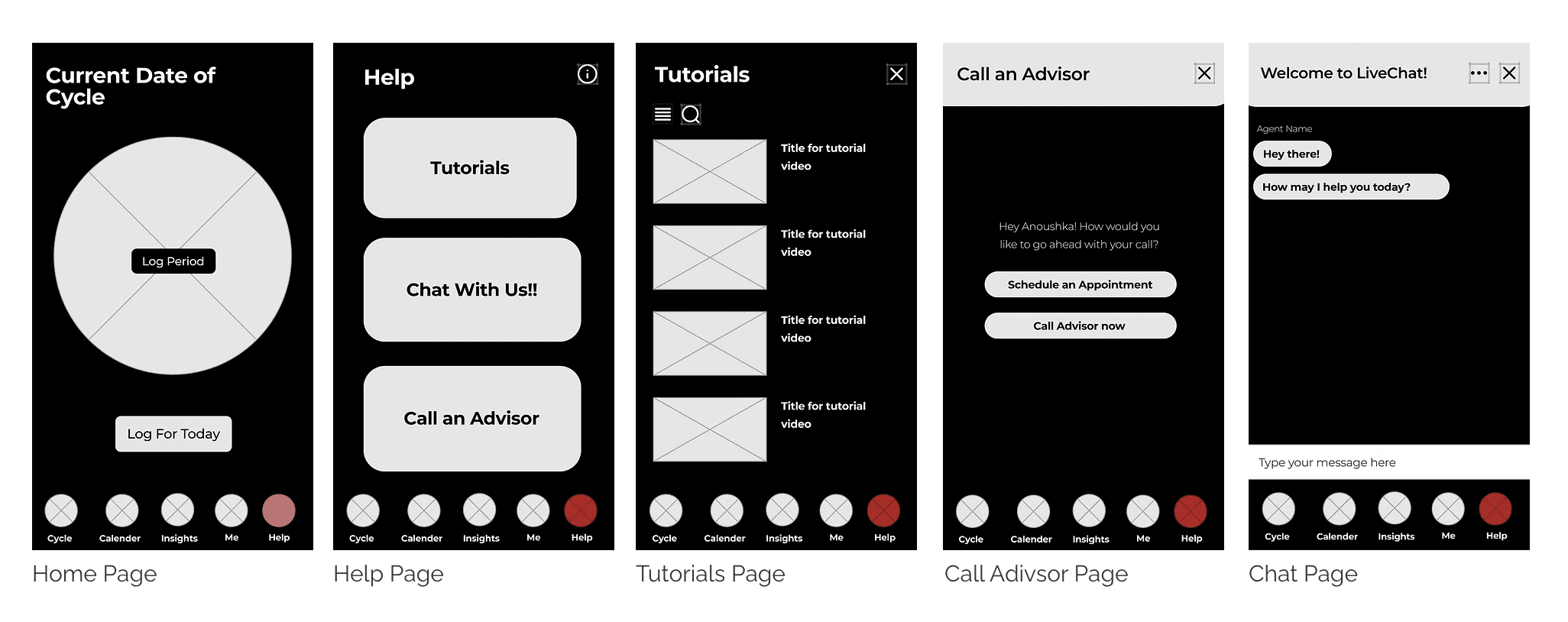
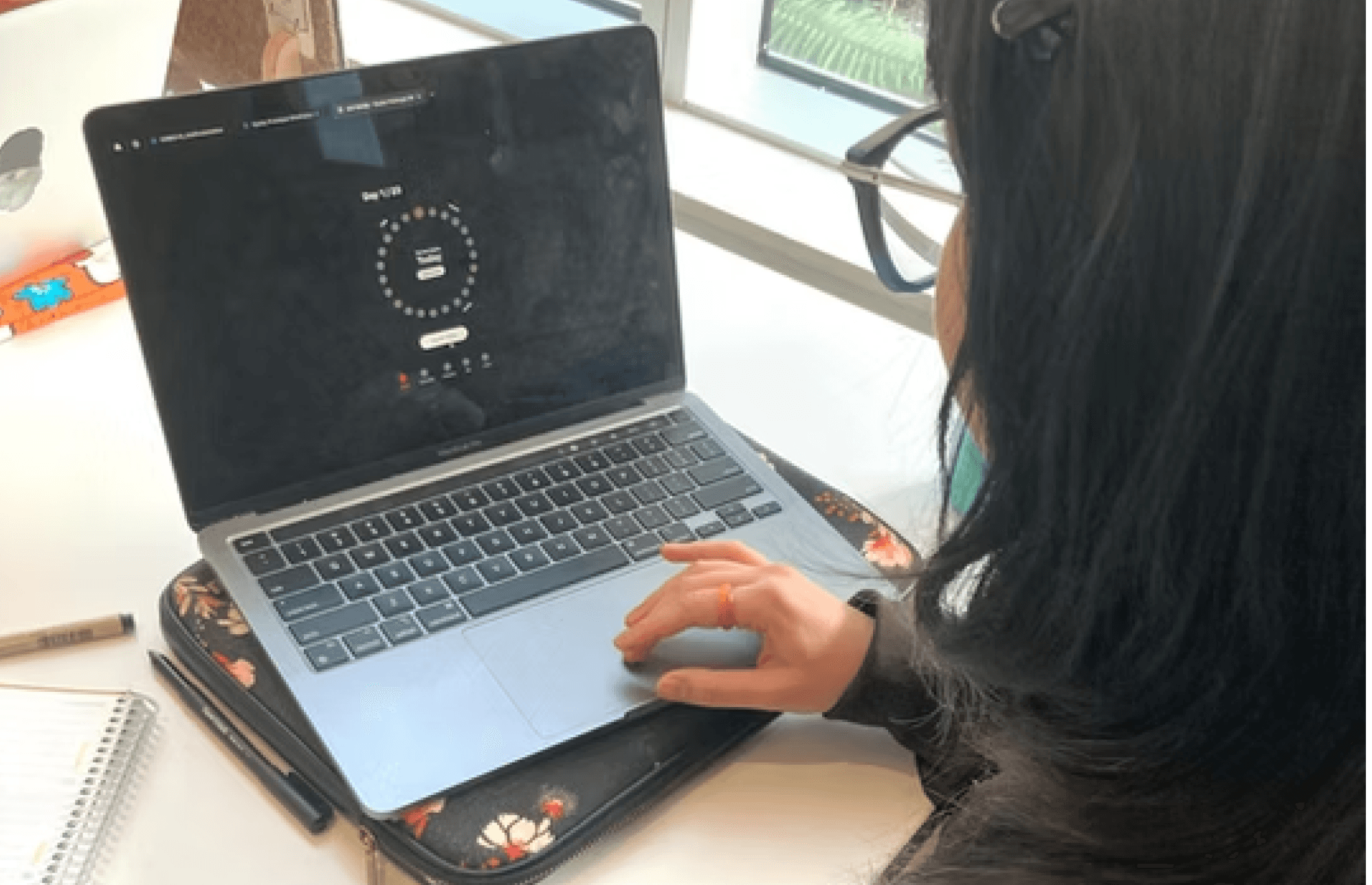
Key Screens of the Design
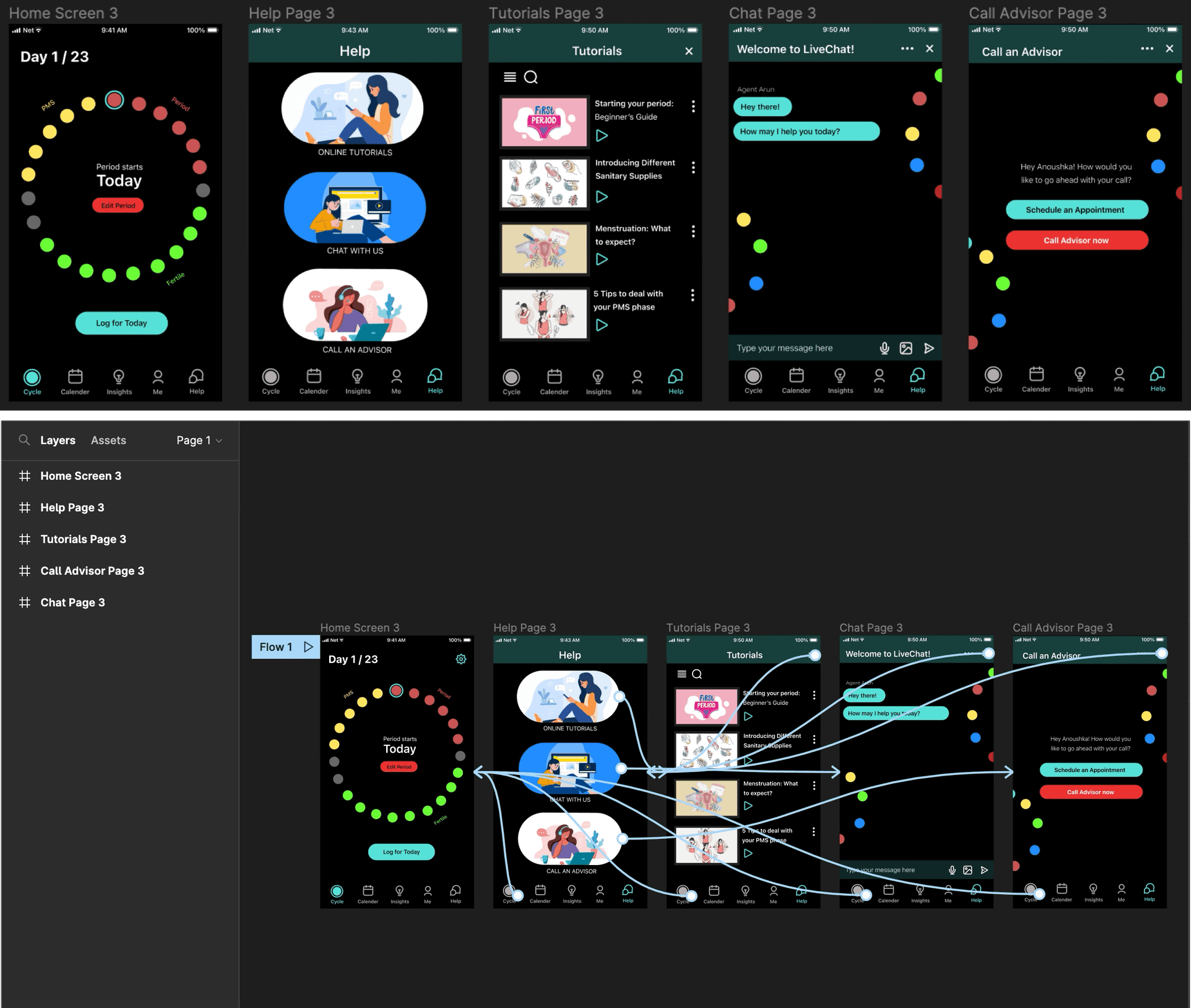
After multiple iterations and user feedback, the final design came to life. The prototype now includes key screens that focus on educational content, step-by-step tutorials, and personalised cycle predictions.
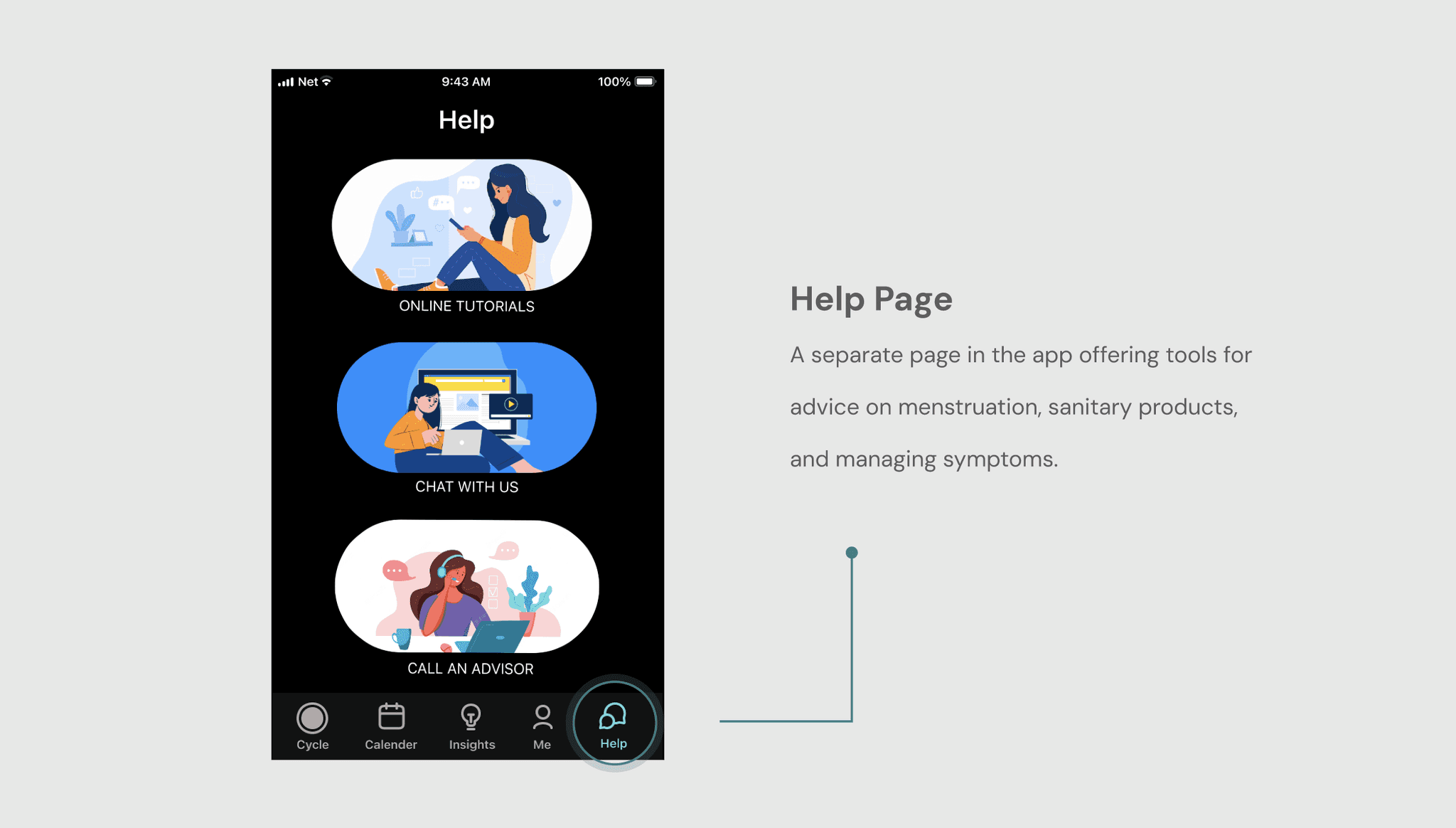
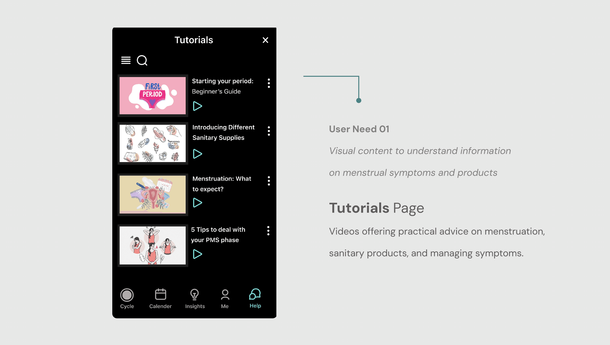
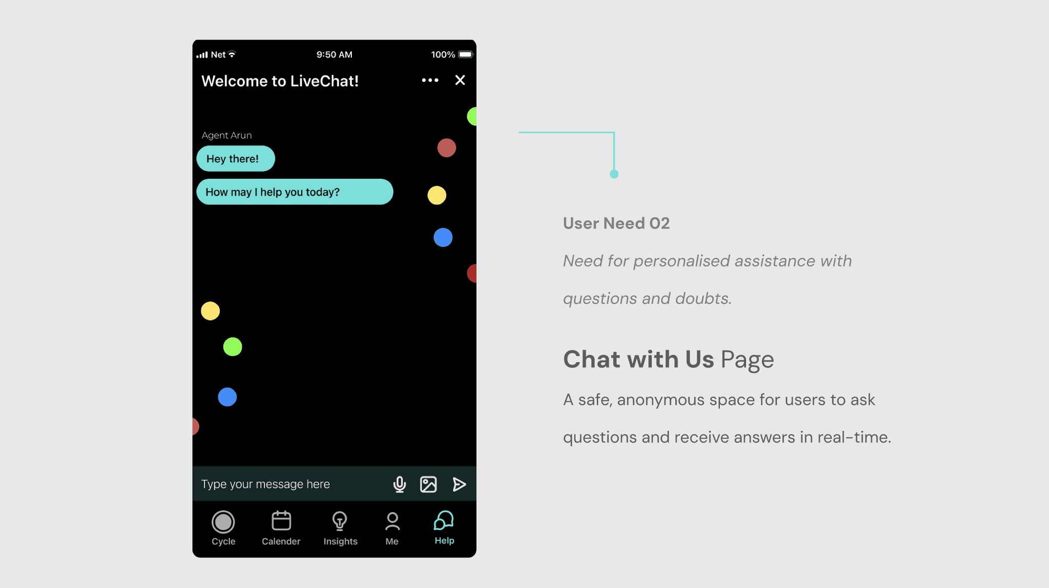
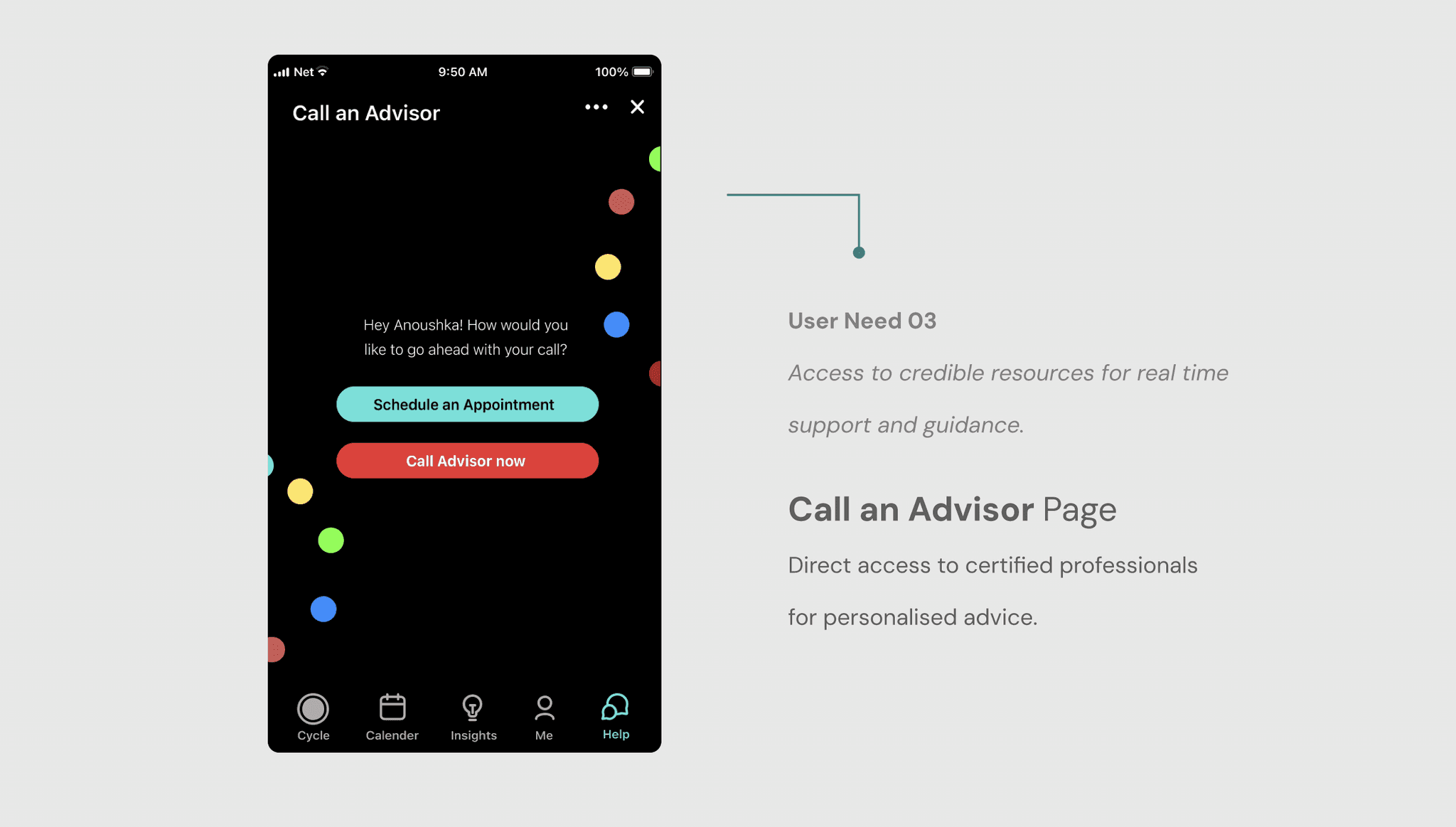
Adding a Help Page
Inside the Help Page
PLAN OF ACTION
Next Steps
Refine Visual Design
Minimising visual distractions and creating a more subdued aesthetic, allowing key elements to stand out, improving visual harmony and reducing cognitive overload for users.
Conduct User Tests
Gathering direct feedback from a larger community of target users to identify pain points, validate design decisions, and iterate on the prototype for improved usability and user satisfaction.
Plan for Scalability
Consider future growth and scalability by designing a dynamic framework and incorporating features that can accommodate increasing user demands and evolving business needs.
Appendix
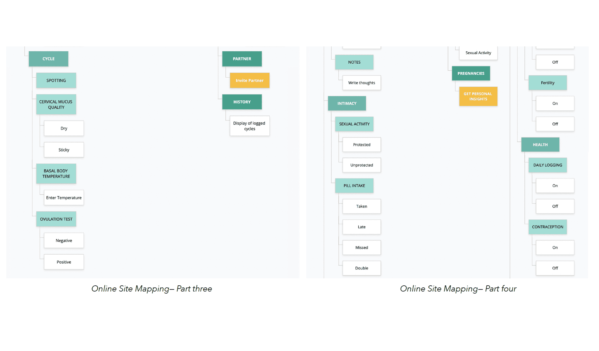
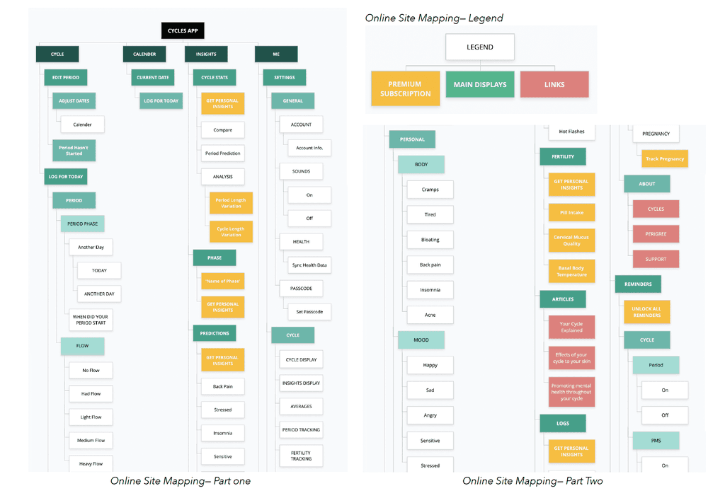
These are other design methods and frameworks that guided our design decisions in developing this service.

